Jira Time in Status Reports: A Practical Guide to Improving Your Workflow
Is your Jira board full of activity, yet projects still fall behind schedule? It’s the most common paradox in project management: everyone is busy, but work isn’t getting done. The reason often lies hidden within your workflow: in rework loops, sprint bottlenecks, and inefficient cycle times that standard Jira reports simply can’t see.
The key to unlocking this mystery is the Jira Time in Status. (but not only)
This guide will walk you through what Time in Status in Jira is, and how you can move beyond basic Jira reports. We’ll show you how to build advanced Jira Time in Status and Cycle reports using the Performance Objectives for Jira app to transform raw data into valuable asset for mastering your workflow.
What is Time in Status in Jira (And Why It Matters for Your Team)?
Jira Time in Status measures the total time an issue spends in each stage of your workflow*. It is calculated by measuring the duration between the ‘entry’ and ‘exit’ for each status. Tracking it effectively allows you to uncover hidden workflow bottlenecks and instantly see where work gets stuck.
Bottlenecks are the silent killers of productivity. They are the stages in your workflow where work piles up, causing delays that ripple through the entire project lifecycle. Identifying bottlenecks is the first step toward a more efficient process. By analyzing how long issues remain in each status, you can pinpoint exactly where the slowdowns are occurring. Are tasks getting stuck in “Code Review” or in “QA Testing”? Time in Status data provides the clear evidence you need to address these issues head-on.
Moreover, Time in Status data can improve sprint forecasting and predictability and help you have objective conversations about streamlining workflow.
*For advanced calculations that require true accuracy, like excluding non-working time with custom calendars (weekends, holidays, etc.) or tracking recurring cycles, a Marketplace app is required.
The Challenge: Native Jira Time in Status Reports vs. The Need for Deeper Insights
Jira offers a few built-in gadgets and reports to help you get a basic understanding of Time in Status.
- The Control Chart, for instance, can show the cycle time of issues, giving you a sense of how long they take to move from “In Progress” to “Done.” It displays key data like the average, rolling average, and standard deviation to help you understand trends and spot variations. Among its benefits is that you can select more than one status to include in the chart, and you can also exclude non-working days from the calculation. However, the Control Chart is a native Jira report and cannot be added to your Jira dashboard along with the rest of your third-party app or native gadget charts. Moreover, it may be difficult for users to interpret it at a glance.
- The Average Time in Status gadget can provide a high-level overview of where time is being spent. It shows the average time spent in a single selected status for resolved issues over a specified period, displayed in a trendline view. It is limited and lacks flexibility.
- The Average Age gadget shows the average number of days issues remained unresolved over a given period. Its limitations include the lack of detailed breakdowns, the fact that it only works with unresolved issues, and that it does not show actual time in status.
While these tools are a good starting point, they often lack the depth and customization needed for a thorough analysis. They can be hard to configure and may not provide the granular insights required to truly understand the nuances of your workflow.
This is where an app from the Atlassian Marketplace becomes essential.
The Rise of Specialized Jira Time in Status Apps
Recognizing the limitations of Jira’s native tools, a large amount of apps dedicated solely to Time in Status have emerged on the Atlassian Marketplace. These applications typically excel at one thing: presenting your Time in Status data in a clear, tabular format. This can be a significant step up from the built-in options, offering a more detailed and accessible view of your workflow’s performance.
However, this singular focus can also be a drawback. While a table of data is informative, it often lacks the visual appeal and intuitive nature of graphical representations. Furthermore, relying on separate apps for each specific reporting need can be financially unsustainable and lead to a cluttered, disjointed Jira experience.
Unlocking Advanced Jira Reports with Performance Objectives
At DevAcrobats, we believe you shouldn’t need a separate app for every individual reporting need. Performance Objectives for Jira is designed as a flexible solution that can support a wide range of team and department-level reporting requirements across your organization. It helps address Time in Status reporting and other common challenges by extending Jira’s native capabilities. The app enhances Jira’s potential as a business intelligence tool, making it easier to create reports that may be difficult or limited in standard Jira or in single-purpose reporting apps.
With a vast list of metrics, and advanced features like: target settings, formula and conditional metrics, rich data filtering and many more, you can measure what truly matters to your team, all within Jira.
This all-purpose app goes beyond the limitations of single-focus tools by offering a comprehensive approach to Jira reporting. It’s not just about tracking Time in Status – it delivers a full suite of performance measurement and analysis tools. Since this article highlights the importance of Jira Time in Status reporting, here’s a snapshot of what Performance Objectives offers through its robust set of ready-to-use metrics that go well beyond just Time in Status, including:
- Cycles in Assignee
- Cycles in Status
- Cycles in Sprint
- Overdue Time from Date
- Remaining Time
- Time Between
- Time in Assignee
- Time in Status
- Time Since
- Worklog Time
…and many more metrics that enable comprehensive reporting on time-related Jira data, covering blockers, workflow progress, and more.
On this sample Jira dashboard below, created using the Performance Objectives app’s gadgets, we’ve configured four key Time in Status reports, combined with valuable Sprint-related data and various visualizations to enhance comprehension. Additionally, we’ve included an insightful Lead Time vs. Cycle Time report, along with a use case that highlights the maximum time in status duration.
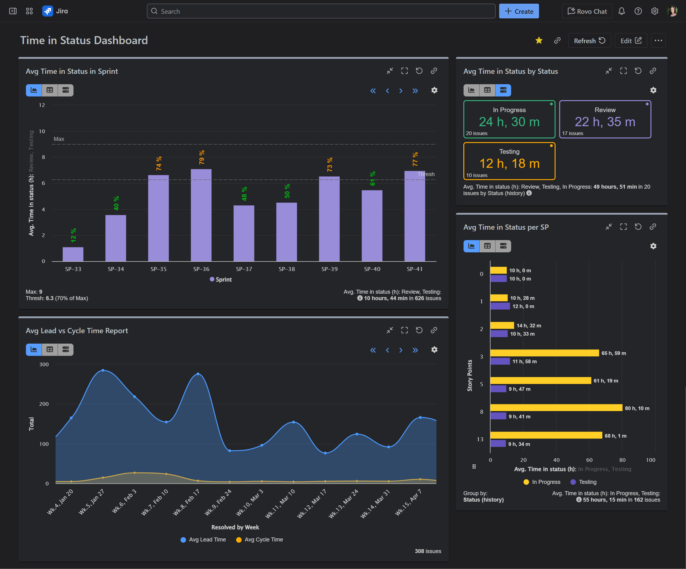
Average Time in Status in Sprint
It provides insight into how well the sprint process is functioning and whether stories are being completed in a timely manner. If stories are spending too much time in certain statuses (e.g., “In Progress” or “Testing”), the team can reassess how they allocate resources or structure work within the sprint.
Average Time in Status by Status (Priority, or other relevant field)
By tracking these values, you can identify bottlenecks or inefficiencies in your workflow. For example, if issues with high priority are stuck in certain statuses for too long, you can take targeted action to address delays. This one is configured with Performance Objectives gadget and allows you to see the data in bar chart, table or tiles view, which provides unmatched flexibility.
Average Time in Status per Story Points
This report correlates effort size (story points) with the time spent in key workflow statuses, helping you understand whether larger stories take proportionally more time, or if there are inefficiencies or inconsistencies in how work progresses, regardless of the relative size.
Average Lead Time vs Cycle Time
This report utilizes the Time between metric and allows you to configure both lead and cycle time and display them in a single chart.
On the second Jira dashboard sample, we’ve configured more advanced time and cycle tracking reports that add additional value by combining two metrics into a single chart, segmenting each metric into custom groups, and incorporating a target threshold for maximum average time in specific statuses. This approach transforms the dashboard from basic reporting into a powerful tool for performance management.

Number of Issues in Sprint vs Cycles in Sprint
This visualization tracks how many times stories move between sprints and how often these issues go through multiple cycles within sprints. It is valuable for identifying whether issues are getting stuck and need to be moved back into the next sprint. By tracking these metrics together on a single chart, you can assess whether your team is taking on too much scope or if the sprint backlog needs further refinement to avoid unnecessary rework.
Cycle Count of Issues in Sprint
This report leverages the app’s metric distribution capabilities to segment cycle counts into custom buckets, providing a detailed breakdown of how many times issues cycle within sprints.
Cycle Time KPI
This report tracks the average cycle time for resolved issues and has set maximum time expectations.
Cycles in Status vs Time in Status Report
By comparing the number of cycles an issue undergoes in a particular status with the amount of time it spends there, this report allows for a deeper dive into efficiency. For example, if an issue has cycled through “To Do” multiple times but spent minimal time there, it may indicate a lack of clarity or miscommunication in the task’s requirements. This helps uncover where work is moving through the system inefficiently, which is essential for optimizing workflow and reducing unnecessary delays.
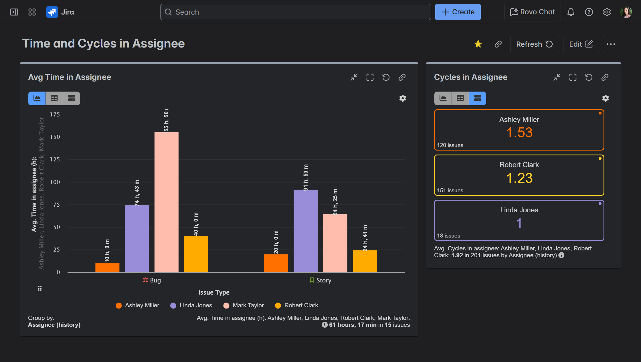
On the third sample Jira dashboard, we’ve showcased the Time in Assignee and Cycles in Assignee metrics, demonstrating their practical use in reports that provide insight into individual performance. These reports go beyond traditional project reporting, transforming the dashboard into a data-driven tool for performance management within Jira.
Average Time in Assignee Report
This chart highlights the average time an issue stays assigned to each team member, giving insight into how long each individual is taking to complete their tasks. If certain team members consistently have higher average times, it could indicate overburdening or process inefficiencies in their workflow. On the flip side, if issues are moving quickly through certain assignees, it could suggest effective personal workflows or areas where best practices can be shared across the team.
Cycles in Assignee Report
Cycles in Assignee metric counts how many times an issue is passed back and forth between assignees, especially when the same few users keep reassigning it to each other. High assignee cycles may signal unclear responsibilities, missing information, or poor task scoping.
Conclusion: Stop Guessing, Start Improving
Your Jira instance is a goldmine of data. By moving beyond simple averages of Time in Status and embracing advanced analysis of Cycle Time, rework loops, and sprint-specific or individual performance, you can finally have data-driven conversations that lead to real, sustainable process improvements.
Ready to uncover the truth in your workflow? Explore the Performance Objectives for Jira app on the Atlassian Marketplace and build a report that truly reflects your process today.