From Custom Pie Chart to Sunburst: Configure Jira Charts with the Circular Gadget
Pie charts are a go-to for data visualization for many Jira users, and for good reason. They offer a quick, at-a-glance understanding of your project data, making it easy to see proportions and distributions. Whether you’re tracking issue statuses, assignee workload, or the types of issues in a sprint, a pie chart can give you a clear visual summary. Their simplicity is their strength, allowing teams to quickly grasp the big picture without getting lost in the numbers.
Jira’s Native Pie Charts: A Starting Point
Jira comes with its own set of tools for creating pie charts through the Pie Chart Gadget and the Workload Pie Chart on your dashboard. These are handy for basic reporting. You can easily configure them to display data from a specific project or a custom filter, and then group the issues by a chosen field like ‘Assignee,’ ‘Status,’ ‘Issue Type’, etc. For many teams, this is enough to get a general sense of what’s going on in their projects. What we appreciate about the native Pie Chart gadget is that it automatically groups fields beyond the top 10 into an “Other” category, keeping the chart clean and easy to read.
The Limitations of Native Jira Pie Charts
However, as your data and reporting needs grow more complex, you’ll quickly run into the limitations of Jira’s native pie charts. Here are some of the common challenges:
- Lack of Customization: The native gadgets offer very little in terms of customization. You can’t change the colors, for example, or the order. When presenting data by priority, having the highest priority as green is very confusing. Similarly, in the Workload Pie Chart, you can’t adjust the time format settings.
- Limited Field Selection: The native Pie Chart in Jira displays issue counts grouped by a single field, such as standard Jira fields (Assignee, Status, etc.) or certain types of custom fields. However, text type custom fields are not supported as Statistic Type, as well as number and date fields. The Worklog Pie is also limited, displaying only 3 time metrics: Time spent, Original estimate, and Current estimate, available if time tracking has been enabled by your Jira administrator.
- Limited Filtering Options: You cannot include only certain values within a field (like only some labels or a particular component) in the gadget’s settings; instead, you must first filter your data using a JQL query and create a saved filter.
Introducing the Circular Gadget by Performance Objectives
This is where the Circular gadget from the Performance Objectives app comes in. It’s a versatile gadget that overcomes the limitations of Jira’s native pie charts, allowing you to create highly customizable and insightful visualizations of your project data.
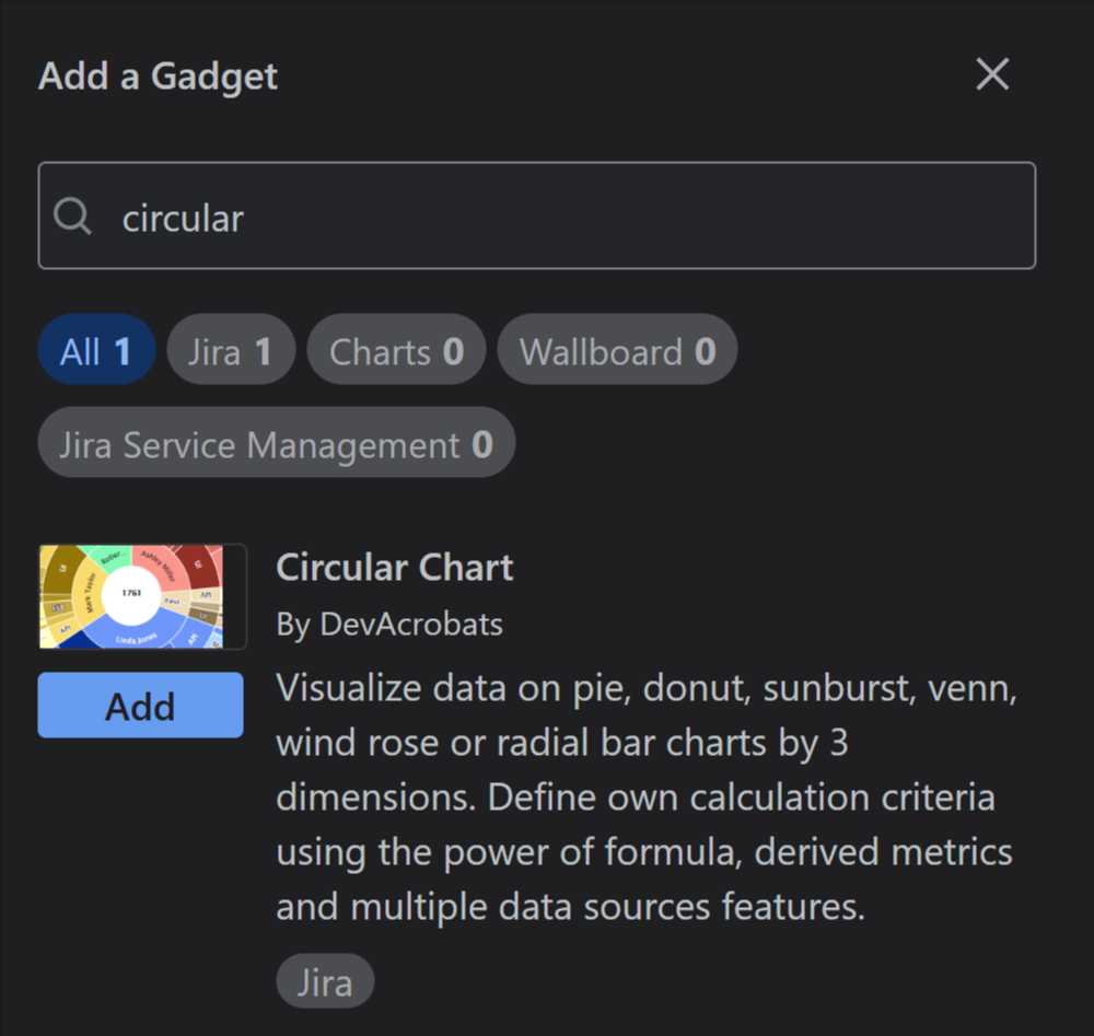

The Circular gadget isn’t just one chart, it’s a whole suite of circular chart types in one gadget. Here’s what you can create:
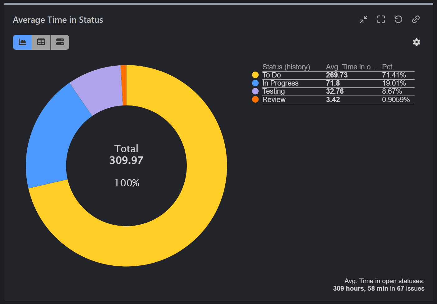
- Pie and Donut Charts: Go beyond the basics by reporting on a wider range of metrics and fields, such as Time in Status, Time Since, SLAs, custom number fields, and text type custom fields. You also get more customization options, including the ability to filter out certain values, change colors, and reorder segments.
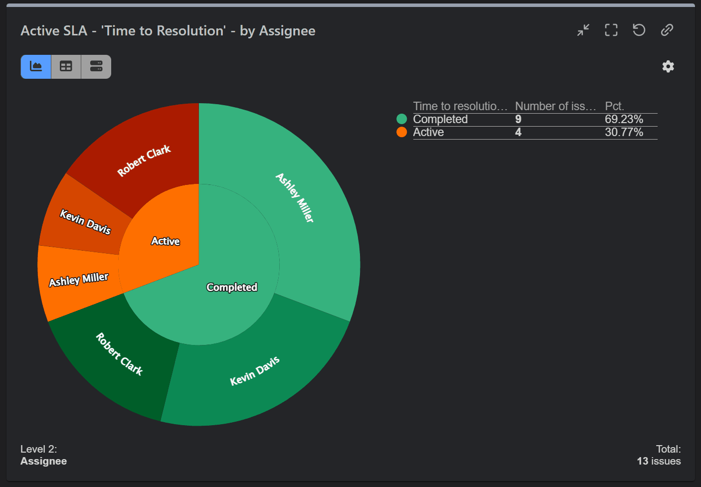
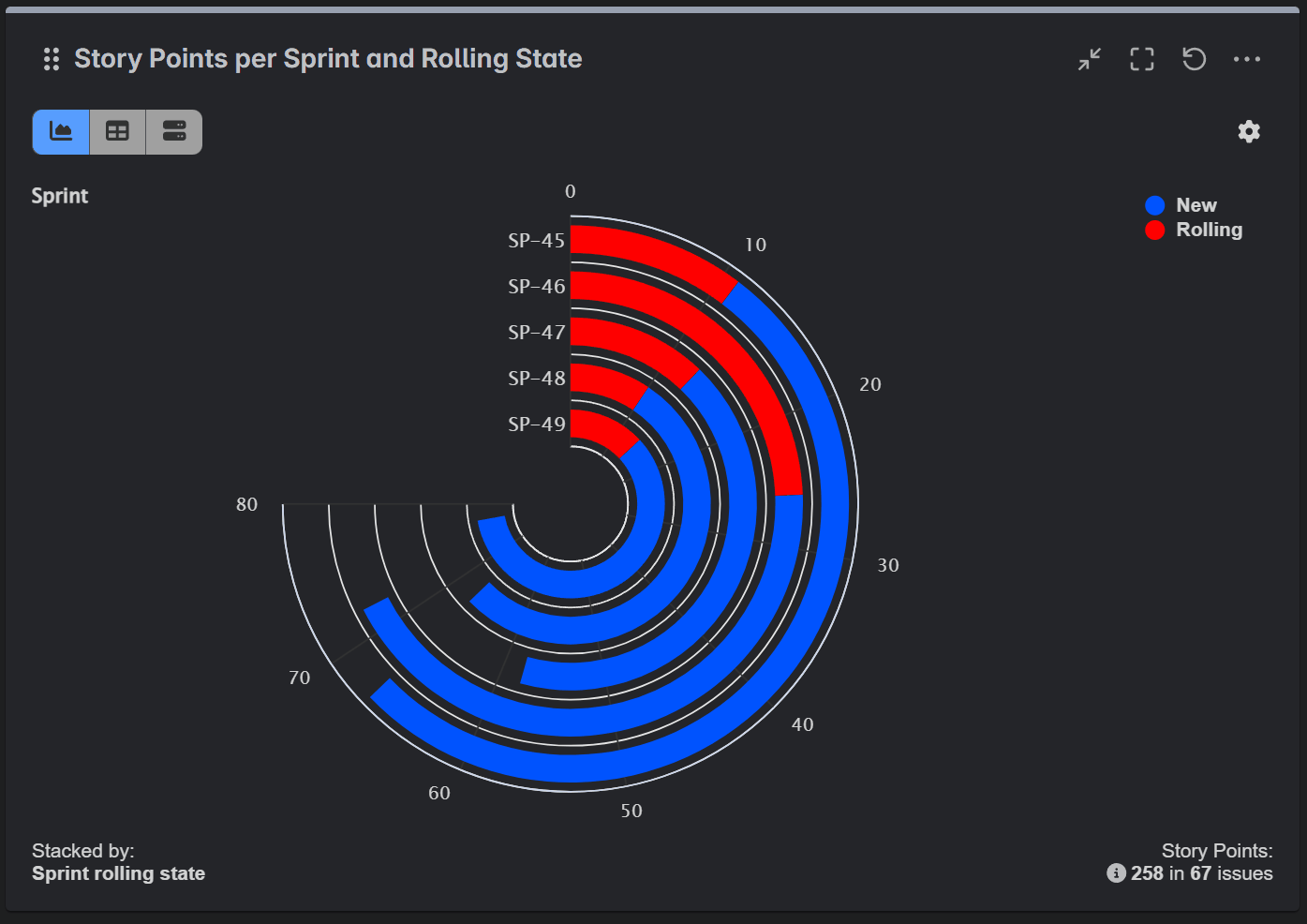
- Sunburst Charts: Visualize hierarchical data with ease. A sunburst chart is like a multi-level pie chart, perfect for showing relationships between parent and child issues, epics and stories, or any other hierarchical data in your projects.
- Radial Bar Charts: A visually appealing way to compare a single metric across a small number of categories. It’s a great alternative to a standard bar chart as a stylistic choice to make a dashboard stand out and draw attention to a particular report.
- Wind Rose Charts: This type of chart is most effective for visualizing data that has both a directional (or cyclical) component and a magnitude component. While traditionally used in meteorology to represent wind speed and direction, it can also be applied to other fields. Additionally, it is useful for displaying time-based patterns, and can serve as a visually engaging alternative for presenting hierarchical or categorical data.
The strong features of the Circular gadget include:
- Advanced Filtering: In the Data Source settings, you can filter only the data you want to see.
- Field Selection: Choose from a rich set of fields, including those not supported by the native Jira Pie Chart. This includes standard, custom, numeric, and date fields, as well as dynamic, app-specific fields such as ‘Cycles in Sprint’ or Assignee, Worklog related fields, ‘Time in Status’ or Assignee, ‘Overdue State’ and many others.
- Customization: Full control over colors, label order, and four chart types. Plus the flexibility to switch between tile and table views.
- Interactivity: Create dynamic and engaging dashboards.
- Versatility: Choose from a wide range of chart types to find the perfect visualization for your data.

If you need a custom Jira pie chart, our Circular gadget is a great fit. It goes beyond just pie charts. Explore the additional chart types it combines within a single gadget. You can effortlessly switch between visualizations to find the one that best suits your needs and compliments you Jira dashboard.
Here’s how each chart type can be most effectively used:
Pie and Donut Chart: These charts are especially effective for visualizing part-to-whole comparisons within small datasets. With their clear and distinct segments, they enable quick understanding of the relative proportions of different categories while providing an immediate grasp of the overall picture.
Sunburst Chart: Ideal for visualizing hierarchical data and offering quick summaries. You can click on any inner segment to drill down and explore the data in more detail.
Wind Rose Chart: While not its primary purpose, this type of chart can serve as a visually engaging alternative to a standard bar or pie chart when comparing values across a small number of categories. For example, it can be used to compare the number of issues by priority level or issue type. It also works well for data that follows a repeating cycle, such as workload by day of the week or issue creation by hour of the day. As a bonus, it looks really nice on a dashboard.
Radial Bar Chart: This chart offers a visually engaging alternative to standard bar charts, making your reports more appealing and impactful. It works well for presenting a small number of categories that follow a sequence or hierarchy, such as: comparing one metric across multiple projects or sprints or visualizing the distribution of a metric across various issue types
Take Your Jira Reporting to the Next Level
While Jira’s native pie charts are a good starting point for basic data visualization, they can’t provide the deep insights that modern teams need. When you’re ready to move beyond the basics and unlock the full potential of your project data, the Circular gadget from the Performance Objectives app is a great fit for the job. With its advanced features, multiple chart types, and rich customization options, you’ll be able to create engaging and insightful dashboards that will help you make better decisions and drive your projects forward.
Pie charts aren’t suitable for every type of data or report, which is why we offer a set of versatile chart types to suit any reporting need or data scenario. These include:
- Bar Chart: Ideal for comparing values across different categories.
- Line / Area Chart: Perfect for tracking how a metric changes over a period of time.
- Tree Map: A space-efficient way to visualize hierarchical data using nested rectangles.
- Heat Map: Excellent for identifying patterns and correlations by using color intensity to represent data magnitude across two dimensions.
- Venn Diagram: Designed to show the overlap and relationships between different sets of data.
- Scatter and Bubble Chart: Used to visualize the relationship and distribution between two or three variables to identify trends or outliers.
- Multi-Metric Chart: A powerful hybrid chart for comparing two or more different metrics on a single graph.
- Tiles: Great for highlighting single metrics or KPIs.
- Table: An effective way to display raw, detailed data in a clear, organized format.
The Performance Objectives app available on the Atlassian Marketplace with a 30-day free trial. Browse our comprehensive documentation, watch tutorial videos, and explore a rich library of KPI example reports for Jira.