Jira Dashboard Gadgets

The Performance Objectives app provides 10 powerful Jira dashboard gadgets, designed to enhance your reporting experience. Choose from essential chart types like bar, trend, pie, donut, heatmap, and scatter plots, or explore more unconventional visualizations such as bubble, wind rose, sunburst, tree map, and multi-metric charts. Each gadget is fully configurable, allowing you to switch between the chosen chart, table view, or tile layouts. No matter your reporting needs, there’s a visualization to match every Jira data scenario.

Performance Objectives

The flagship gadget delivers bar and column charts with all the essential and advanced features for any Jira user or reporting need.

Performance Trend Gadget

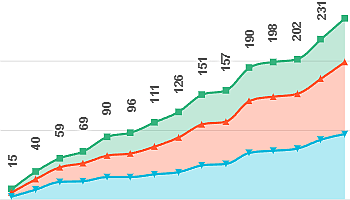
This gadget offers line and area charts with full set of powerful features to visualize trends in your Jira data – just like our flagship one.

Circular Gadget

The Circular Chart gadget combines Sunburst, Pie, Donut, Radial Bar, and Wind Rose charts – your all-in-one toolkit for circular data visualization.

Heat Map Gadget

Uncover hot and cold spots in your Jira data with color-coded heatmaps – ideal for spotting patterns and correlations at a glance.

Multi Metric Combined Chart

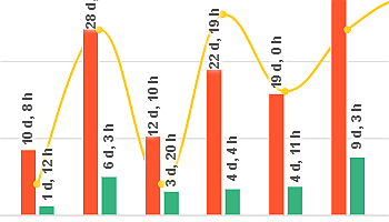
Analyze up to 10 metrics in one chart – perfect for comprehensive cross-metric insights in your Jira data in a bar and trend chart format.

Multi Metric Trend Chart

This gadget supports advanced dual-axis line and area charts and allows you to track multiple metrics over time.

Scatter & Bubble Chart

Visualize relationships between Jira metrics. Spot outliers, identify correlations, and explore up to three dimensions of data.

Tree Map Gadget

Visualize part-to-whole relationships with this gadget. Drill down up to three levels for powerful, dynamic analysis of hierarchical Jira data.

Venn Diagram

Analyze data intersections with the Venn Diagram – visualize overlaps for Components, Labels, Fix Versions, and more.

Change History Gadget

Track and audit field changes with this gadget – gain insights to improve project management, decision-making, and compliance in Jira.

Pivot Table

View raw Jira data in table format to inspect exact numerical values – perfect when precision matters more than charts or visuals.

Tiles

Switch from chart to Tiles View to display each x-axis item as a distinct tile with a % of total indicator. You can also set Tiles as the default view.